

The mobile revolution has taken the digital world by storm. The tiny devices we carry in our pockets have transformed into powerful tools that serve as our gateway to the online realm. From information-seeking and social networking to e-commerce and beyond, mobile devices have become indispensable in our daily lives. Given this monumental shift in user behavior, it’s no wonder that mobile-friendly web design has emerged as a paramount consideration for anyone with an online presence.
Understanding the Mobile Revolution
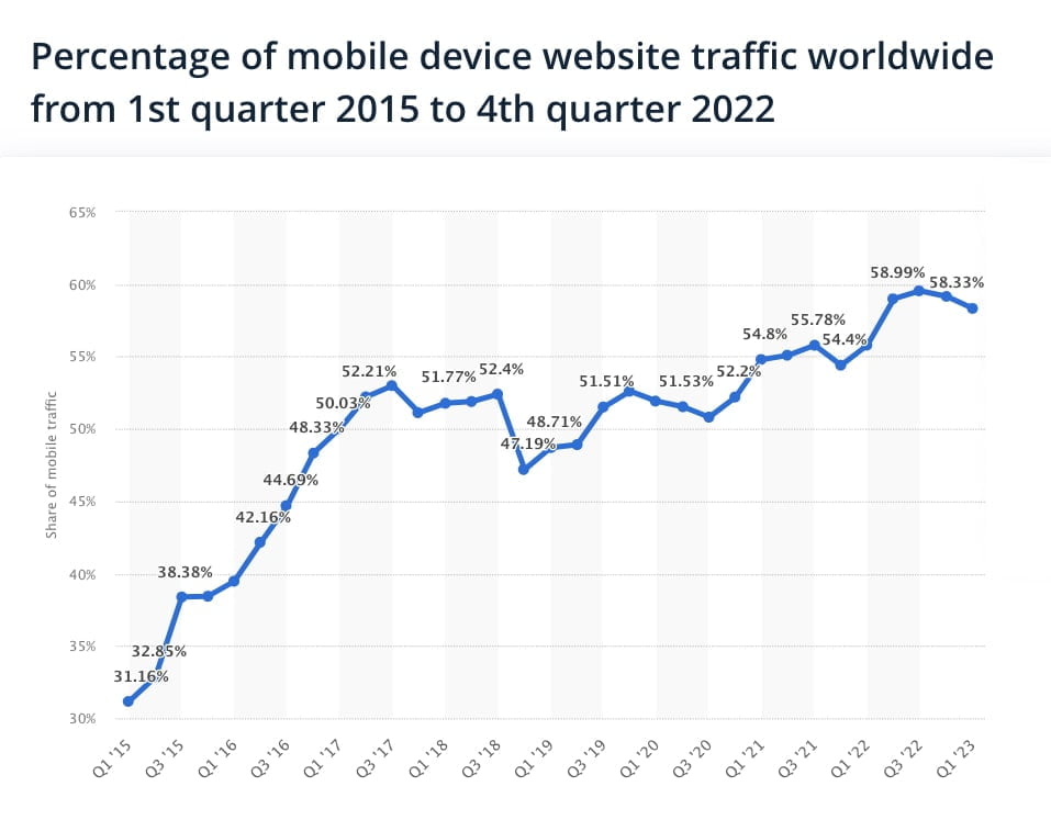
The statistics are staggering: As of 2021, there were 4.32 billion global mobile users, and in the United States alone, 81% of the population uses smartphones. The average daily time spent on mobile devices also increased, going over 4.5 hours. With such a substantial mobile user base, it’s not just important but essential to ensure that your website is mobile-friendly. We’re shopping, working, connecting, and exploring the digital landscape, all through the screens of our mobile phones.
The implications for businesses are profound, particularly for e-commerce websites. As a modern business owner or marketer, it’s imperative to recognize the critical role that mobile devices play in consumer behavior. To underscore this point, consider this: in 2022, mobile devices accounted for more almost 60% of total global website traffic. The mobile revolution is no longer on the horizon; it’s here, and it’s dominating the digital landscape.
What Is Mobile-friendly Web Design?
In its essence, mobile-friendly web design is a design approach that ensures websites look and function seamlessly on mobile devices. This entails the seamless adaptation of website content and layout, regardless of screen size. At the core of mobile-friendliness is a design philosophy known as “responsive design.” When your website is responsive, it dynamically adjusts its appearance based on the device being used, whether that’s a mobile phone, tablet, or desktop computer.

Why Mobile-friendliness Matters
Now, you might wonder: why is mobile-friendliness so vital, and how does it directly impact e-commerce websites? Let’s delve into a few essential aspects.
SEO Benefits of Mobile-friendly Web Design
First and foremost, mobile-friendliness significantly influences your search engine ranking. Search engines like Google understand that mobile-friendliness enhances the user experience, and they prioritize websites that offer seamless mobile access. The consequence? A higher likelihood of your e-commerce site appearing on the first page of search engine results, thereby increasing your visibility to potential customers.
User Engagement
Now, let’s talk user engagement. A mobile-friendly e-commerce website encourages users to explore your site, stay longer, and engage more with your content. It’s a simple equation: when users can navigate your website effortlessly and access information without frustration, they are more likely to interact with your products and services.
Conversion Rates
When it comes to e-commerce, conversion is the ultimate goal. Whether it’s making a purchase, signing up for a newsletter, or engaging with your content, conversions are the lifeblood of your online business. According to a study by KoMarketing, about 62% of users are less likely to purchase from a site that isn’t mobile-friendly. If your e-commerce site isn’t optimized for mobile, you risk losing potential customers at the most crucial stage of their journey.

Responsive Design: A Crucial Component
At the heart of mobile-friendly web design is responsive design, a concept that has become synonymous with user satisfaction. Responsive design involves a blend of techniques, such as fluid grids, flexible images, and media queries, which allow a website to adapt its layout according to the user’s device.
Fluid Grids
A fluid grid ensures that website content adjusts to different screen sizes. This approach offers a unified experience regardless of the device, ensuring that users can easily view and interact with your site.
Flexible Images
Flexible images are another integral element of responsive design. They ensure that images scale appropriately, maintaining the integrity of the content without causing distortion. This is especially critical for e-commerce sites, as high-quality product images are vital for showcasing your offerings effectively.
Media Queries
Media queries act as the brain behind responsive design. They detect the characteristics of a user’s device and apply the appropriate style rules accordingly. This enables text and images to resize, menu options to reconfigure, and other design elements to adapt seamlessly.
Google’s Mobile-first Indexing
As search engines aim to improve the user experience, they have embraced mobile-first indexing. Google, in particular, now primarily uses the mobile version of the content for ranking and indexing. If your e-commerce site isn’t mobile-friendly, you could miss out on the benefits of this mobile-first approach, potentially leading to a lower search engine ranking.
User Experience and Mobile Responsiveness
For e-commerce websites, user experience is everything. To cater to the evolving expectations of users, a user-centered approach to mobile-friendly design is essential. Here’s how it impacts your e-commerce venture:
- Intuitive Navigation: Mobile-friendly design ensures that the navigation is intuitive, allowing users to find products, check out, and explore your site effortlessly.
- Touch-friendly Elements: With touch-screen navigation being the norm on mobile devices, having touch-friendly elements is crucial. Buttons and links should be easily tappable.
User Experience Enhancement for E-commerce
For e-commerce sites, user experience isn’t just about convenience; it’s about driving sales and conversions. A responsive design fosters a positive experience that encourages visitors to become paying customers.
The Competitive Advantage
Mobile-friendly web design doesn’t merely cater to the requirements of your audience; it also offers a competitive edge. In the fiercely contested realm of e-commerce, where customers have countless options at their fingertips, providing a seamless mobile experience sets you apart from the competition.
Your Path to Mobile-friendly Success
As you commence your journey toward optimizing your e-commerce website for mobile-friendliness, consider the following vital steps:
1. Responsive Design: Prioritize responsive design to ensure your website adapts seamlessly to various devices.
2. Fast Loading Times: Enhance loading speed by optimizing images and minimizing unnecessary scripts. Google reports that as page load time goes from one second to ten seconds, the probability of bounce increases by 123%
3. User-Centered Approach: Create intuitive navigation and touch-friendly elements for the best user experience.
4. SEO Enhancement: Recognize that mobile-friendliness impacts search engine rankings, and optimize your website accordingly.
5. Stay Competitive: In the highly competitive e-commerce landscape, delivering a seamless mobile experience can set you apart.
Your e-commerce endeavor isn’t solely about selling products; it’s about crafting a memorable and efficient shopping experience for your customers. The mobile revolution has reshaped consumer behavior, and by prioritizing mobile-friendliness, you position your business for success in this new era.
The future belongs to businesses that value user experience and adapt to the changing digital landscape. By focusing on mobile-friendly web design, you’re not only meeting current user expectations but also preparing for the demands of tomorrow.
Make Your E-commerce Site Shine on Mobile
Now is the time to embrace mobile-friendliness and stay ahead of the competition. You’ll be offering your customers an experience they won’t forget, and they’ll thank you with their loyalty and conversions.
If you’re ready to embark on your journey toward a mobile-friendly e-commerce site, we’re here to help. Our team at Reciprocal specializes in creating responsive and user-centered web designs. We understand the nuances of mobile optimization and can transform your online store into a mobile-friendly masterpiece.


