
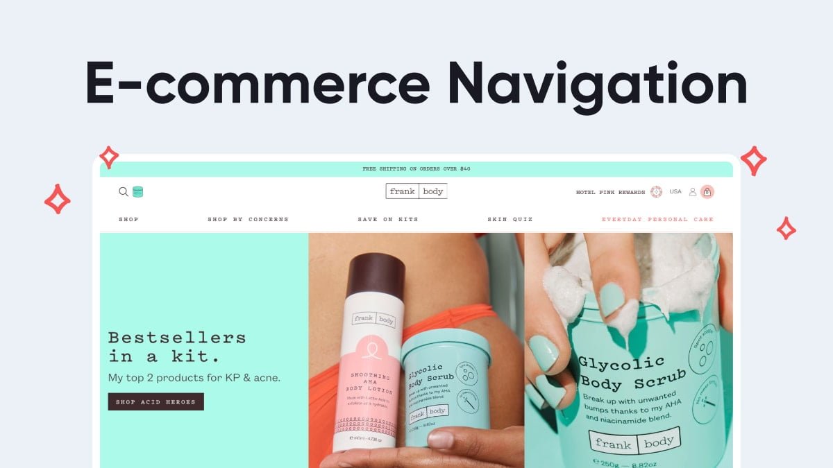
In the ever-evolving landscape of e-commerce, one aspect remains constant: the importance of a user-friendly navigation system. In this digital age, where online shoppers have an abundance of choices at their fingertips, a seamless and intuitive navigation experience can be a game-changer. As an e-commerce business owner or marketer, understanding and implementing the best practices for user-friendly navigation in e-commerce is essential for success.
Navigating an e-commerce website should be as effortless as strolling through a physical store, with every aisle clearly marked, and products neatly organized. Frustrating, confusing, or labyrinthine navigation can quickly lead to visitor abandonment, missed sales, and a tarnished reputation. The good news is that there are tried-and-true strategies and best practices that can help ensure your customers find what they’re looking for with ease.
The Importance of User-friendly Navigation
Before delving into the best practices, let’s emphasize why user-friendly navigation in e-commerce deserves your utmost attention. It’s not just about making your website look good; it directly impacts your business’s bottom line.
E-commerce statistics paint a compelling picture of this impact:
- Online shoppers say that clear and logical website navigation is essential when making a purchase decision.
- A study by Baymard Institute found that 25% of e-commerce users abandon their purchase due to complex navigation and website structure.
- An estimated 30% of e-commerce site visitors use the search function to find products. This highlights the importance of robust search functionality and clear menu options.
Clearly, user-friendly navigation plays a crucial role in reducing bounce rates, encouraging exploration, and ultimately driving conversions. By understanding and implementing the best practices outlined in this article, you can create a positive shopping experience that keeps customers coming back.
Understanding Your Audience
The foundation of user-friendly navigation begins with a deep understanding of your target audience. Consider these key aspects:
1. Know Your Audience’s Preferences: Take the time to understand what your typical customer expects from an e-commerce site. Consider conducting surveys or interviews to gather insights.
2. User Research: Dive into user research to gain insights into how your audience interacts with your website. Where do they encounter challenges? What are their expectations?
3. User Personas: Create user personas that represent different segments of your audience. This helps you tailor your navigation to specific user needs.
Understanding your audience is the first step in crafting a navigation experience in e-commerce that resonates with your customers. What works for one audience may not work for another, so personalization is key.
Clear and Intuitive Menu Structures
The menu structure of your e-commerce site is the backbone of your navigation system. To ensure it’s user-friendly, consider the following:
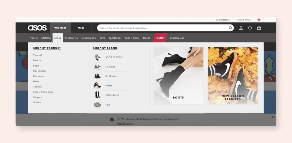
1. Categorization and Hierarchy: Organize your products or content into logical categories and subcategories. This clear hierarchy simplifies the user’s journey through your site.
2. Dropdown Menus: Utilize dropdown menus sparingly to provide access to subcategories without overwhelming the main menu.
3. Flyout Menus: Flyout menus are a valuable addition to help users quickly explore product categories and subcategories. They should appear when a user hovers over or clicks on a menu item.
Clear and intuitive menu structures allow users to effortlessly locate the products or information they desire. Avoid overcrowding your menus with too many items, as simplicity is often more effective.
Optimizing the Search Functionality
The search functionality on your e-commerce site should be a robust tool for users to find products efficiently. To optimize it:
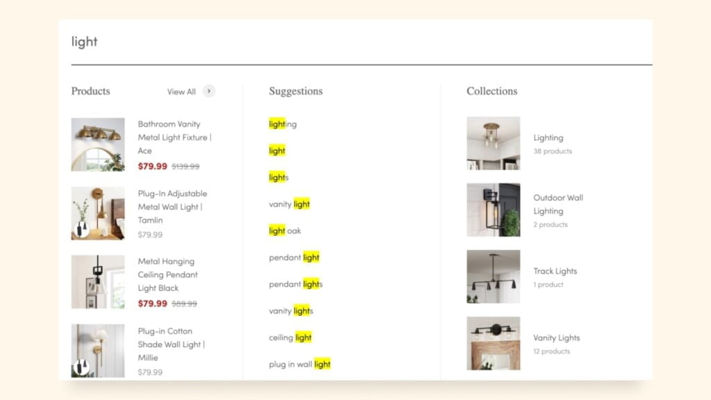
1. Search Accuracy: Ensure that your search functionality provides accurate results and understands user queries effectively.
2. Filters and Sorting: Implement filters and sorting options to allow users to refine their search results based on attributes like price, size, color, and more.
3. Auto-suggestions: Incorporate an auto-suggest feature that predicts user queries as they type. This can significantly speed up the search process.
A reliable search function saves users time and provides an alternative to menu navigation, making it an indispensable element of user-friendly navigation in e-commerce.

Mobile-friendliness and Responsiveness
Mobile devices have become the primary tools for online shopping. In 2024, over 6.7 billion mobile users were recorded worldwide. Best practices for mobile-friendliness and responsiveness in e-commerce navigation include:
1. Responsive Design: Implement responsive design to ensure your website adapts seamlessly to different screen sizes, whether it’s a mobile phone, tablet, or desktop computer.
2. Consistency Across Devices: Maintain a consistent user experience across all devices. This includes ensuring that menus are easily navigable on mobile screens.
3. Touch-screen Navigation: Optimize your site for touch-screen devices. Ensure buttons and links are large enough to tap accurately.
By prioritizing mobile-friendliness, you cater to a vast audience and offer a consistent user experience, regardless of the device they use.

Visual Navigation Aids
Visual cues are vital in guiding users through your e-commerce site. Here are some best practices:
1. Images and Icons: Use high-quality images and icons to represent categories, products, or actions. Visual elements grab users’ attention and make navigation more engaging.
2. Call-to-action (CTA) Buttons: Employ clear, visually distinct CTA buttons to direct users to essential actions like “Shop Now,” “View Details,” or “Add to Cart.” Using a noticeable color for the most important CTA is crucial to draw users’ attention.
3. Labels and Descriptions: Provide concise labels and descriptions to accompany images and icons. These aid in quickly understanding the purpose of visual elements.
Visual navigation aids serve as signposts in your e-commerce journey. They make the browsing experience more intuitive and enjoyable.
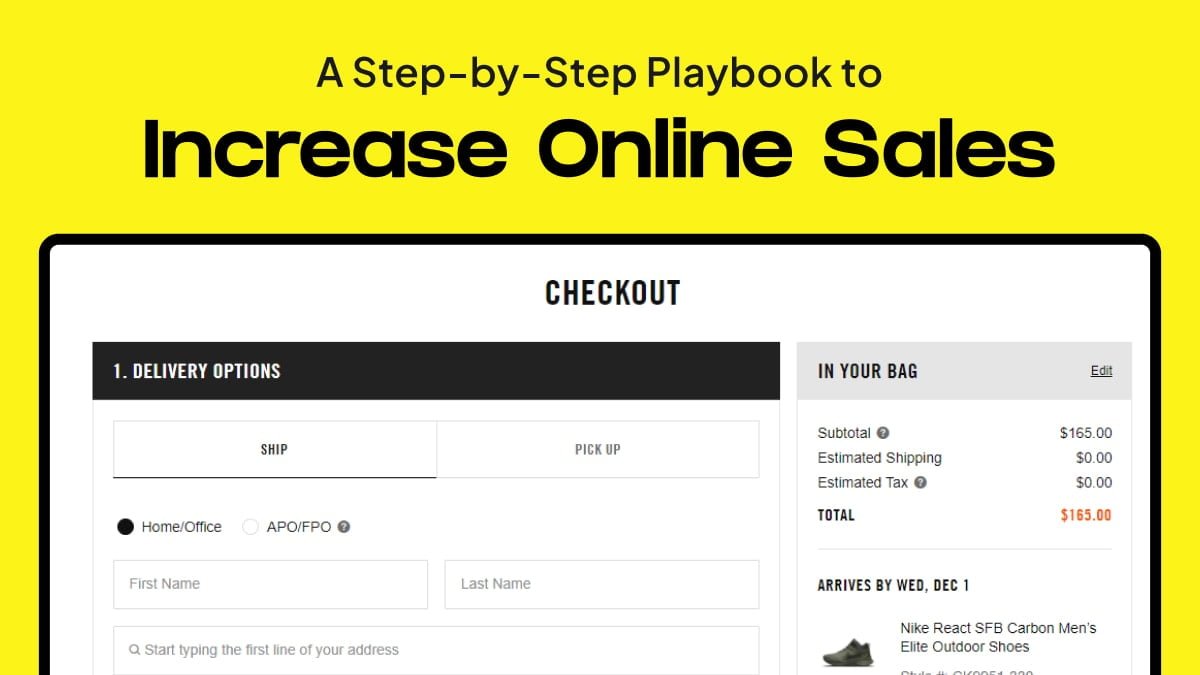
Streamlining the Checkout Process
The e-commerce checkout process is where the rubber meets the road in terms of conversion. Your navigation should guide users seamlessly through this critical stage:
1. Reducing Friction: Eliminate distractions during checkout. Ensure the path from product selection to payment is straightforward and clutter-free.
2. Progress Indicators: Implement progress bars or indicators to inform users about the stages of the checkout process. This helps manage expectations.
3. Guest Checkout Option: Offer a guest checkout option for users who want to make a quick purchase without creating an account.
By streamlining the checkout process, you maximize the likelihood of completed transactions and satisfied customers.
Accessibility and Inclusivity
Accessibility is a fundamental aspect of user-friendly navigation in e-commerce, and it’s also legally required in many regions. To create an inclusive experience:
1. Web Content Accessibility Guidelines (WCAG): Adhere to WCAG guidelines to ensure your website is accessible to all users, including those with disabilities.
2. Alternative Text: Provide alternative text for images, making your visual content accessible to screen readers.
3. Keyboard Navigation: Ensure all features, links, and forms can be navigated and operated using a keyboard.
Data-driven Navigation Enhancements
Leveraging data is a powerful method for enhancing your navigation system. Here’s how to implement data-driven improvements in e-commerce navigation:
1. Analytics and Data: Utilize website analytics to understand how users interact with your site. Identify areas where users commonly drop off or encounter difficulties.
2. Personalization: Implement personalization to cater to individual user preferences. This can include showing relevant products based on past behavior.
3. A/B Testing: Conduct A/B tests to compare the performance of different navigation structures and features. Use the results to make informed decisions.
By taking a data-driven approach to navigation enhancements, and using certain tools, you can continuously refine your e-commerce site to meet user needs.
Wrapping Up
In the competitive world of e-commerce, user-friendly navigation is not merely an option; it’s a necessity. By understanding the importance of clear and intuitive navigation and implementing best practices, you can create a shopping experience that delights customers and boosts your business’s success.
The takeaways are clear: reduce friction, optimize search, ensure mobile-friendliness, embrace visual navigation aids, streamline the checkout process, prioritize accessibility, and leverage data. With these strategies, you’ll navigate your e-commerce business toward a brighter future.
So, whether you’re a seasoned e-commerce veteran or just starting your online retail journey, remember that user-friendly navigation is your compass to success.
Start implementing these best practices, and watch your e-commerce venture thrive in the digital landscape.
