We resolved United Pet Care’s issue of poor user connection by redesigning their website for each audience, which boosted brand recognition, strengthened partnerships, and eased the creation of impactful marketing materials.
The Challenge
United Pet Care, an innovative pet care plan provider, had a new tech-focused CEO come in who wanted to modernize their brand, from the visual branding to messaging and website.
However, they faced a problem – they had three separate audiences – members, employers, and vets – with no overlapping benefits and messaging. This made it hard for users to determine what content was relevant to them and resulted in poor connection and impact.
We first had to do a simplified emergency overhaul for an upcoming conference, and then quickly thereafter do a full redesign.
The Outcome
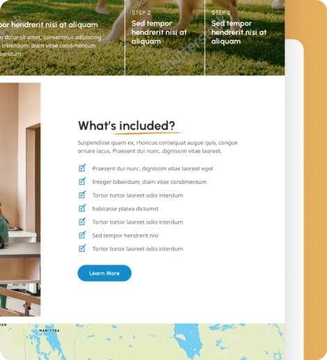
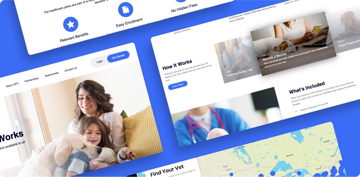
We transformed their website with a tailored experience for each separate audience and used this as an opportunity to refine their brand’s creative direction through updated color, icons, photos and more.
The result has been a great increase in brand awareness and recognition, and internally there is much more confidence in the brand. Through refining their brand guidelines, creating new and impactful marketing materials has never been easier for them.
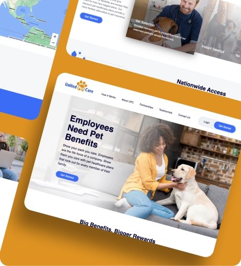
Designing a User-Focused Website for Three Unique Audiences
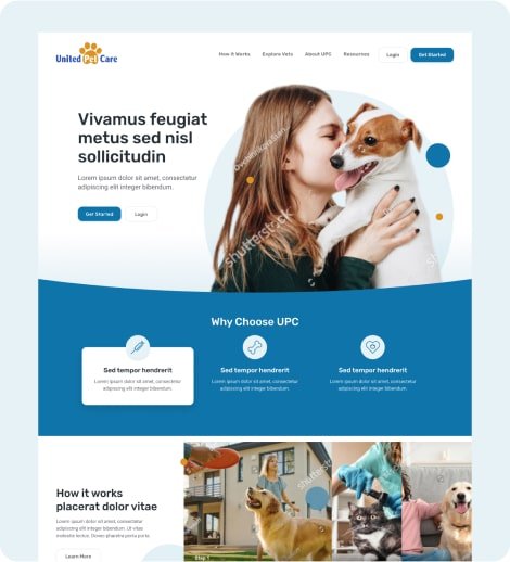
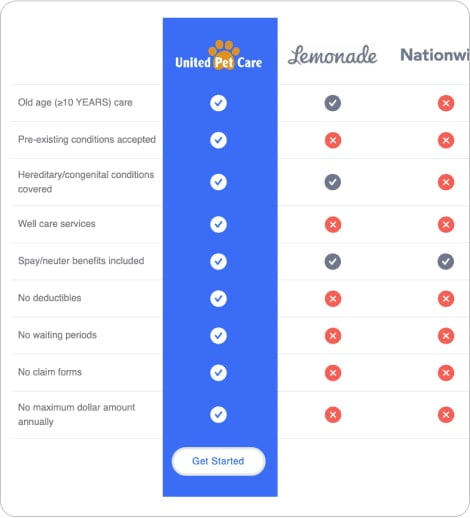
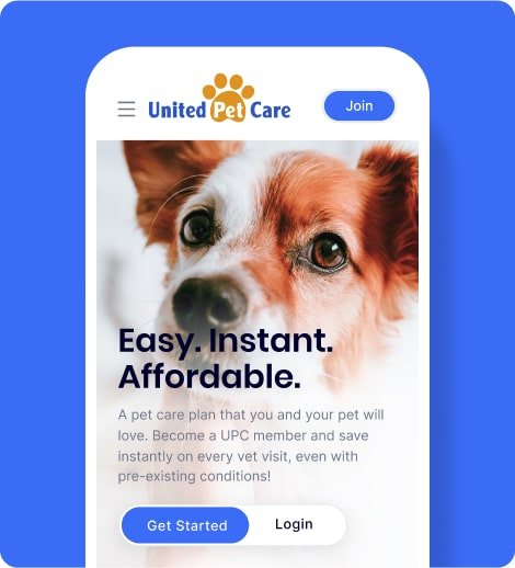
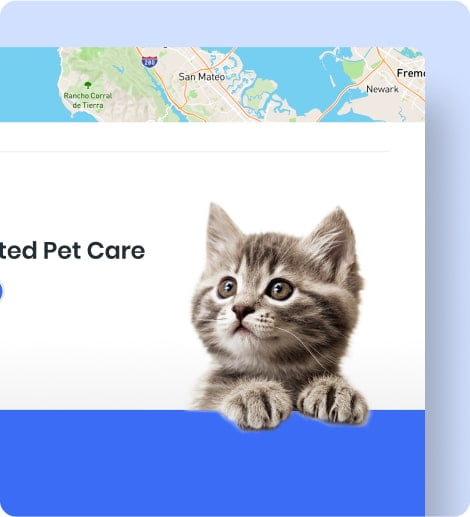
United Pet Care’s mission is to provide an easy, instant, and affordable pet care plan for pet owners, with no exclusions based on age, pre-existing conditions, breed, or animal type. The company was looking for a transformation of its online presence to match its innovative approach to pet care.
With the new, tech-focused CEO in place, United Pet Care was eager to modernize its brand. However, the company faced a significant challenge – they had three separate audiences with no overlapping benefits and messaging, making it hard for users to determine what content was relevant to them and resulting in poor connection and impact.
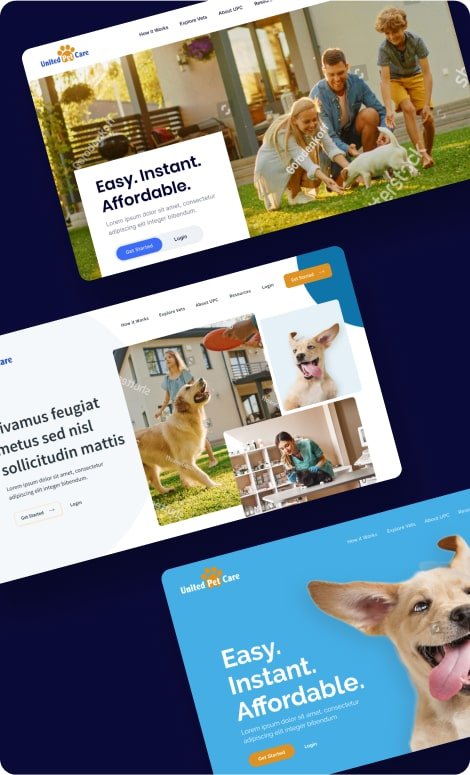
Our initial quick turnaround redesign for an important conference.
With a big conference coming up soon after the new CEO took over, we knew that time was of the essence.
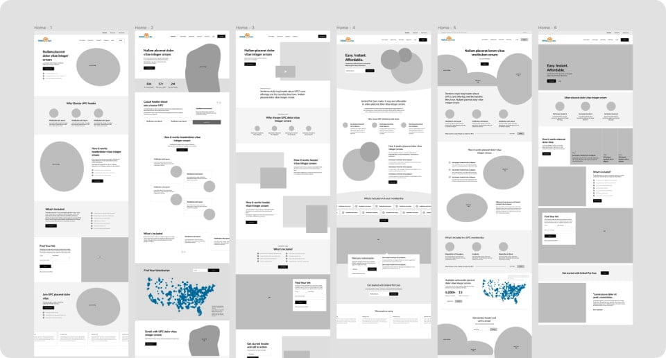
So, we quickly went to work and created a super streamlined website architecture that reorganized the value spread across multiple pages into a small handful of pages.
Our team presented three directions of wireframes on two key pages and chose the best one to flesh out across the rest of the site. We also presented two visual directions, choosing the best one to refine.
The emphasis was on getting the site up and running in time for the conference, so design choices were made that favored easy-to-develop components whenever possible.
Wireframes showing possible structural differences on the homepage.
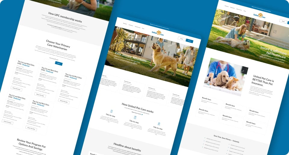
For the full redesign, we wanted to provide a fully thought-out and refined website that would solve the problems United Pet Care was facing with its old site.
To ensure we found the perfect solution, we explored a wide range of directions in how to structure the site, using wireframes that allow us to move quickly.
We presented six refined directions, focusing on the main home page and sub-sites.
Using this as an opportunity to expand the visual design of the overall brand, we explored many directions.
We explored multiple visual design directions and chose the best one to build out across the site.
The brand hadn’t been updated for a long time and we used this redesign process as a great opportunity to refine their brand’s creative direction. We did this through updating and expanding the brand’s color palette, icons, photos and more.
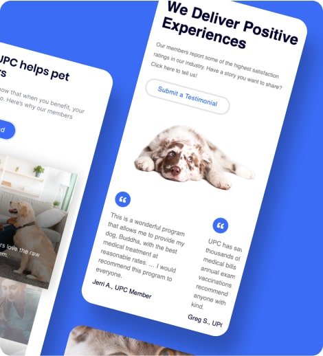
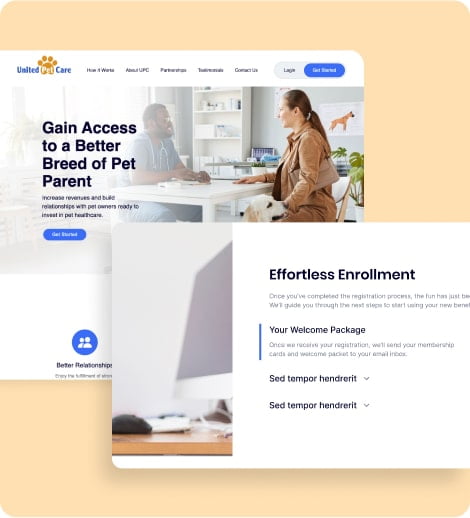
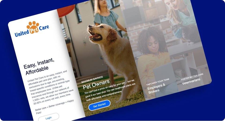
With the goal of having completely unconnected sub-sites for each audience - members, employers, and vets - we created a main intro page that directed to separate experiences for each audience.
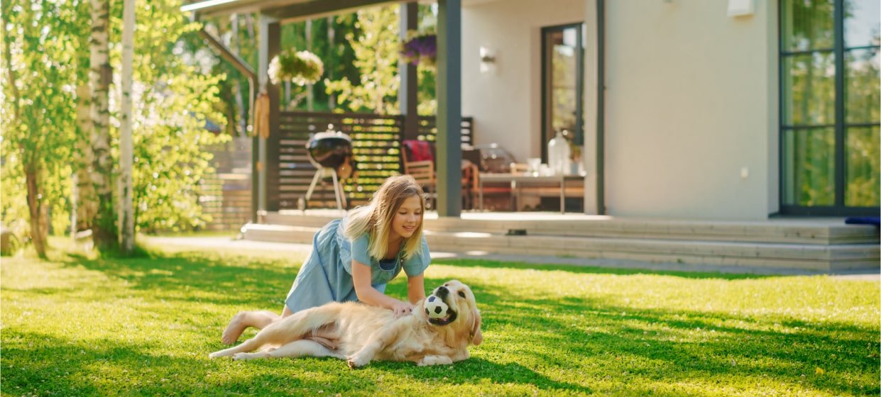
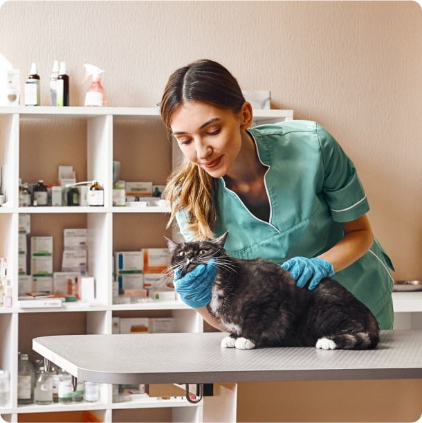
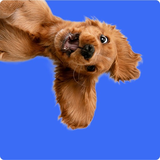
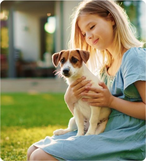
Our team also provided creative direction for stock photography, aiming for a very personable and approachable look that felt real and candid.
The visual direction for the photos was a great place to add some personality to the brand.
The Payoff
United Pet Care’s new website now represents the brand in a modern and inviting fashion and effectively connects with each of its audiences through a tailored user experience, combined with a creative and approachable design.
This has led to an increase in brand awareness and connection which has strengthened their current partnerships and customer base, while opening new possibilities. Additionally, there is a notable increase in internal brand confidence, making the process of creating new and influential marketing materials near effortless.