Hey! 👋
Too many landing pages fall into the trap of trying to say everything at once.
They cram in too many features, use generic promises, or overload the design with bells and whistles.
And the result?
Visitors get distracted. They bounce. They don’t convert.
Simplicity sells. That’s why we created this stripped-down, high-impact landing page checklist.
It focuses on what truly matters: helping your visitor make a confident decision, fast.
✅ The Lean Landing Page Framework
This isn’t some complex funnel setup or 10-step persuasion formula. It’s a clean, proven structure that works across industries and audiences. Here’s why it’s so effective:
-
Purpose-Built: Every section on the page earns its keep. No fluff.
-
Quick to Implement: You don’t need a full redesign to apply it.
-
Customer-Led: Designed around what your audience needs to see to say yes.
-
Battle-Tested: It’s worked for ecom brands, SaaS startups, and service businesses alike.
Let’s dive into the six essential building blocks you need to make your landing page convert.
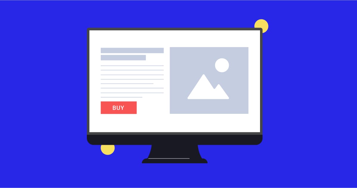
1. The Hero That Hooks
Your hero section is the first impression. It has one job: make people want to stick around.
-
Start with a bold, benefit-driven headline.
-
Add a quick explainer or sub-headline that answers: Why this offer? Why now?
-
Layer in quick-hit credibility: a testimonial, review count, or trust badge.
-
Include one clear CTA—and make it impossible to miss.
2. Benefits That Break It Down
Most visitors skim. Make their life easy.
-
Tie every feature to a concrete benefit. (e.g., “Organic Protein” → “Fuels You Without the Crash”)
-
Use icons or visuals to communicate faster.
-
Frame benefits around solving pain points and delivering outcomes.
3. A Simple “How It Works”
People want to know what they’re signing up for.
-
Explain your product or process in 3-4 easy steps.
-
Show how each step helps them achieve their goal.
-
Eliminate confusion and hesitation.
4. Social Proof that Sells
Trust is a major conversion trigger.
-
Showcase testimonials, reviews, or UGC.
-
Use real faces or video clips when possible.
-
Sprinkle these throughout the page, not just in one spot.
5. Friction-Free Purchase Section
Make buying the natural next step.
-
Reinforce key benefits and value.
-
Remove unnecessary fields or steps.
-
Highlight guarantees, payment options, or free shipping.
-
Include one strong, confident CTA.
6. FAQs That Eliminate Doubt
Your last chance to address hesitations, be strategic about it.
-
Focus only on the questions people actually ask.
-
Use reviews, chats, and customer feedback to guide your answers.
-
Tackle objections head-on: price, process, results, risks.
🚀 Actionable Tip
Open your current landing page and run it against this 6-part checklist. Ask yourself: Are any of these sections missing? Is there anything you could simplify or remove? Even one key change—like tightening your headline or adding a killer testimonial—can lift your conversion rate.
Why This Matters
Most site visitors decide to stay or bounce in seconds. This framework helps you:
-
Capture Attention Quickly: With bold, benefit-first messaging.
-
Build Instant Trust: Through clear structure and social proof.
-
Guide to Action: By making the next step easy and obvious.
You don’t need more content. You need the right content, in the right order.
Happy building,
Adam Goetz @ Reciprocal