Most landing pages fail to deliver the best results for the same reasons. The good news? You don’t need a full-blown workshop to figure out what’s wrong.
With just 10 minutes and a critical eye, you can spot the gaps holding your page back. Think of it as a pit stop tune‑up rather than a complete rebuild.
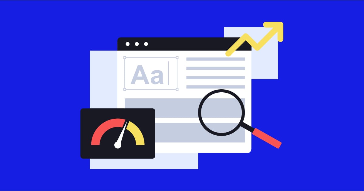
The 5-Part Landing Page Audit
Run through this checklist to see how your page holds up:
1. Clarity (Message)
-
Can someone instantly understand what you offer and why it matters?
-
Is the headline specific and jargon‑free?
-
Do subheadings reinforce the main point instead of repeating it?
2. Design (Visual Hierarchy)
-
Are the most important elements (headline, benefits, CTA) clearly prioritized?
-
Is there enough contrast, spacing, and breathing room?
-
Can the page be skimmed in seconds without losing meaning?
3. Trust (Social Proof)
-
Do you feature testimonials, reviews, or client logos?
-
Are proof points easy to spot near decision‑making areas?
-
Do they feel authentic, not generic filler?
4. Conversion (CTA Visibility)
-
Is your main CTA button visible above the fold?
-
Does the copy focus on outcomes (“Get My Free Guide”) instead of bland labels (“Submit”)?
-
Are CTAs repeated at natural points down the page?
5. Speed & Mobile Experience
-
Does the page load in under 3 seconds?
-
Is the mobile version just as clear and easy to use?
-
Are buttons large enough to tap without zooming?
🚀 Actionable Tip
Pull up your landing page on both desktop and mobile. Set a 10‑minute timer and go through the checklist. Circle the one area that feels weakest and make a quick change today—swap in a clearer headline, surface a testimonial, or move your CTA higher.
Why This Matters
A landing page has one job: get people to take action. When it misses the mark, you’re losing customers. Tightening up even one area can create noticeable results:
-
Clearer messaging = more people stick around
-
Cleaner design = higher engagement
-
Visible trust signals = fewer objections
-
Stronger CTAs = more conversions
-
Fast, mobile‑ready pages = broader reach