Lamb & Co.
Unifying a Home Goods Retailer, Realtor & Designer
TL;DR
We transformed the fragmented web presence of an HGTV star into a unified platform for a home goods retailer, realtor, and designer. This integration improved user experience and resulted in higher sales and better brand positioning.
The Challenge
Lyndsay and Leslie, the twin sisters behind Lamb & Co, offer a handful of services related to realty and interior design. With the success of their TV show, Unsellable Houses, the issue of having completely separate ecommerce and business websites was becoming a user experience nightmare. They needed a website that reflected their growth and was ready for more.
The Outcome
We helped provide a seamless user experience throughout their offerings by restructuring their sites and unifying their WordPress site for realty and interior design companies with the Shopify site for their home goods business. We also gave an overhaul and uplift of the visual design. Which captured the company’s excitement and premium aesthetic.
The result is a beautiful and seamless experience for shoppers that’s optimal for mobile and built to support the growth of current and new ventures. Along with helping increase conversion and average order price through improved pages, the elevated redesign has helped brand value and recognition.
See the Transformation
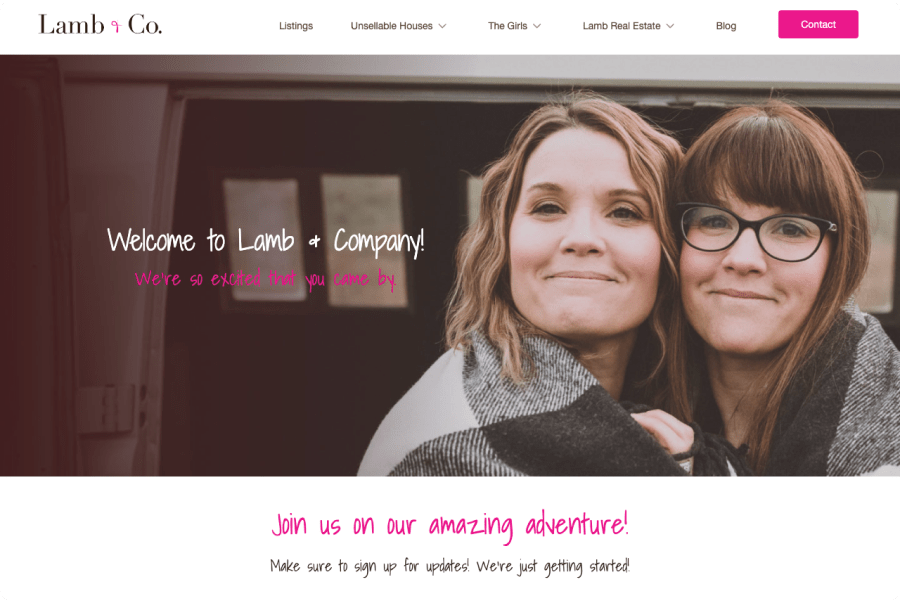
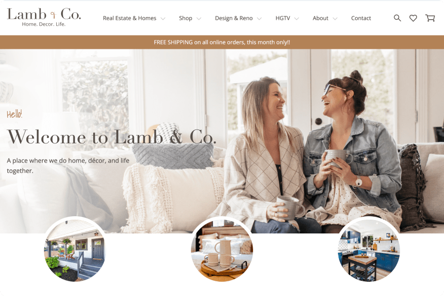
Merging Real Estate, Design, and Retail into One Unified Online Journey
Lyndsay and Leslie, the twin stars of HGTV’s Unsellable Houses, had recently seen significant business growth from the success of their remodeling TV show. Along with being TV stars, they’re also successful real estate agents and interior designers, as well as the owners of a home goods retail and e-commerce business. Needless to say, the twins had a lot to showcase.
Unfortunately, having the e-commerce side of their business on a different web platform from their more realty-focused ventures was creating a frustrating user experience that was resulting in loss of customers and poor brand connection. Along with solving the structural and UX issues, the sites were overdue for a visual overhaul to better reflect the brand and it’s value.
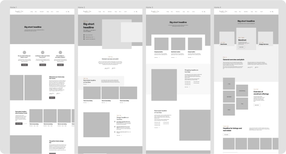
Wireframes showing possible structural differences on the homepage.
Our first project was to restructure the wireframe of their Shopify site, looking for meaningful spots to make structural changes while keeping the existing styling intact. The project was a success, leading to a full web redesign project.
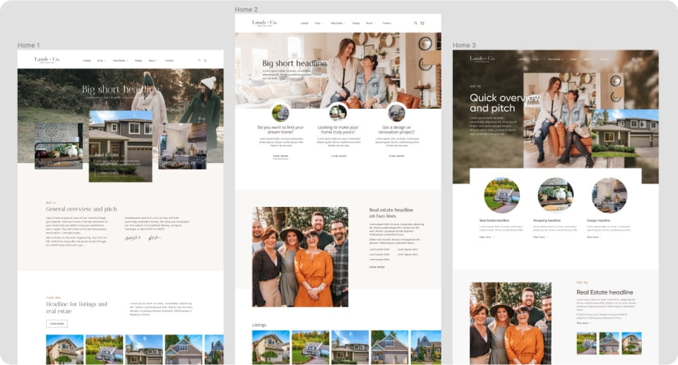
A few visual design directions we explored.
We examined different approaches to the company’s home page and the storefront page, seeking ways to present their offerings in a clear manner and differentiate our design from the competition.
Lyndsay and Leslie ended up preferring separate directions and we landed on a direction that tastefully combined elements from each; resulting in a best-of-both-worlds design that was truly tailored to the twins.
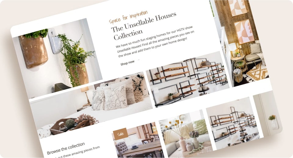
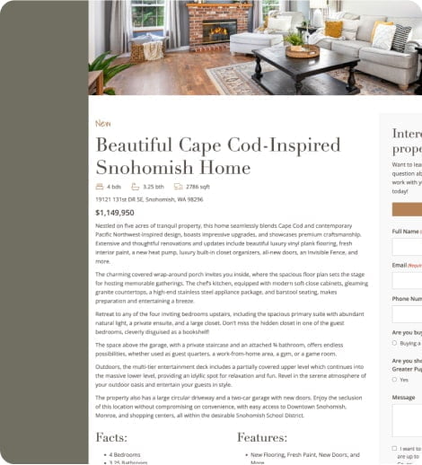
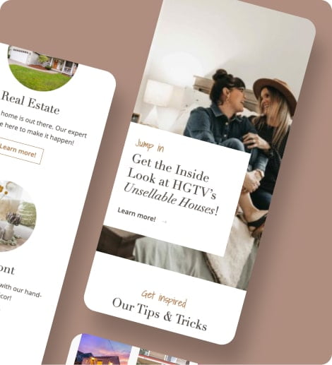
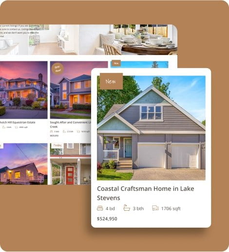
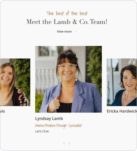
Our aim was to create an experience that was light and inviting, and while having spots of playfulness was still refined and sophisticated.
We also wanted to make sure that we didn’t lean too feminine as to alienate customers. We used a theme of overlapping elements to emphasize the twins connection.
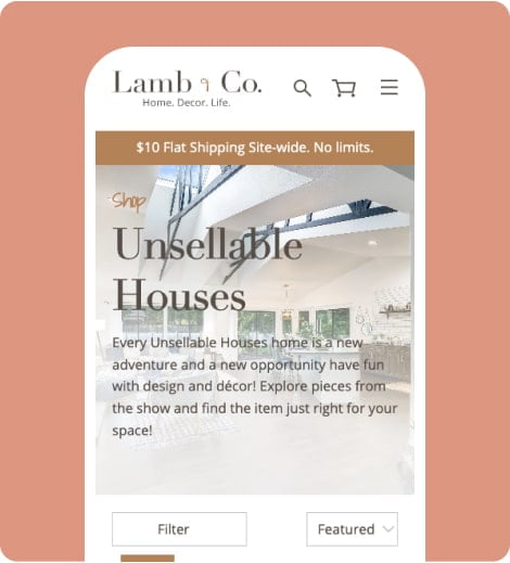
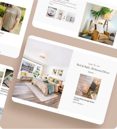
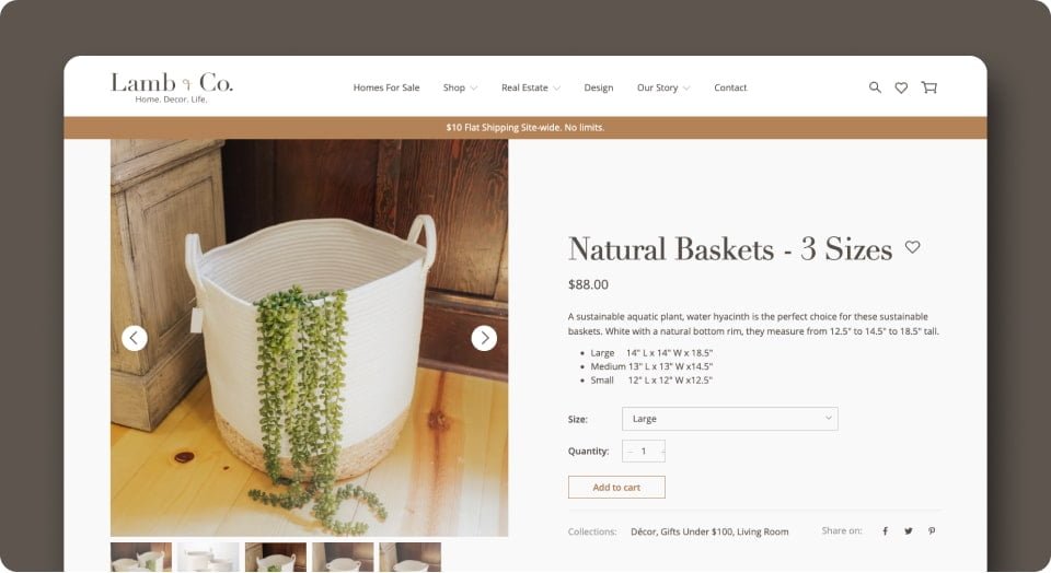
By unifying their WordPress site for realty and interior design offerings, with the Shopify site for home goods, we were able to provide a seamless user experience.
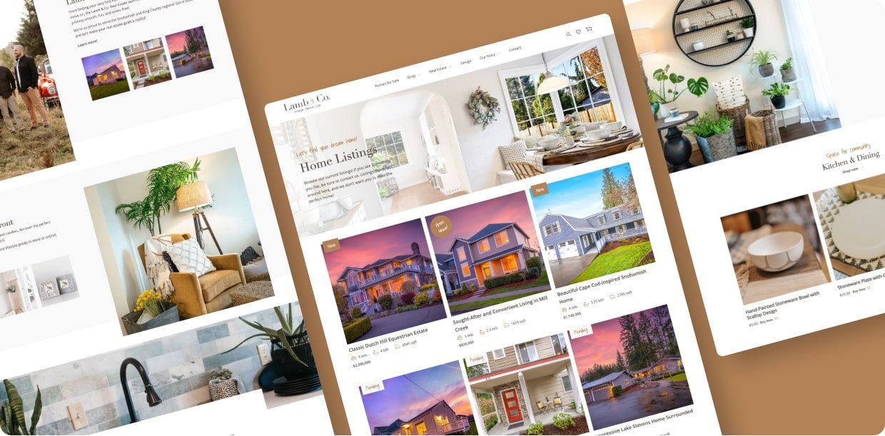
The Payoff
With a beautifully designed website that’s easier to manage and offers a better end user experience, the twins are now equipped with a website and storefront that accurately reflects their expanding businesses and the success of their TV show, Unsellable Houses.
This has led to more impactful and higher converting marketing efforts and an overall increase in orders, average order price as well as overall brand value and recognition.
