Helping a Snack Brand Simplify Buying and Support Growth
Website Redesign Increased AOV for eCom CPG Brand
“The redesign improved the shopping flow, increased average order value, and generated more wholesale and corporate inquiries.”
Margaret Barrow, CEO and Founder, It’s Nola Stocked in office pantries at Google, Netflix and Goldman Sachs
TL;DR
We helped a growing snack brand turn its website into a tool that made it easier for customers to discover flavors and build custom bundles, enabled corporate and wholesale buyers to submit inquiries without endless back-and-forth, and allowed the business to run more efficiently day-to-day.
The Challenge
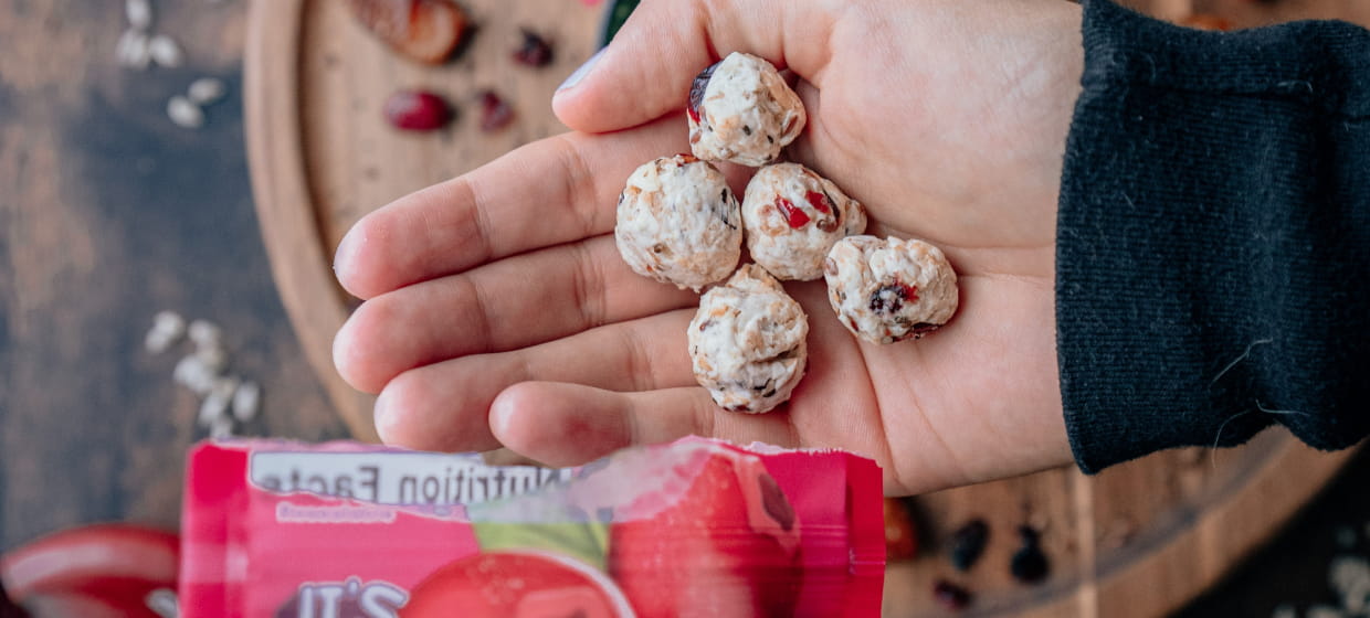
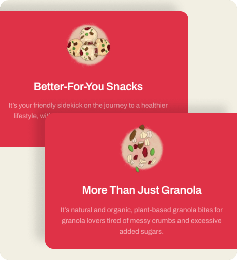
It’s Nola had built a strong brand around its plant-based granola bites, but its website wasn’t keeping pace with the business. The site made it difficult for customers to find information, explore products, and navigate different purchasing paths, while larger buyers often needed additional communication before taking the next step.
The challenge wasn’t simply to refresh the design. It was to create a website that better supported how customers shopped, how the business generated opportunities, and how the company operated day to day.
The Outcome
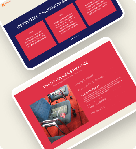
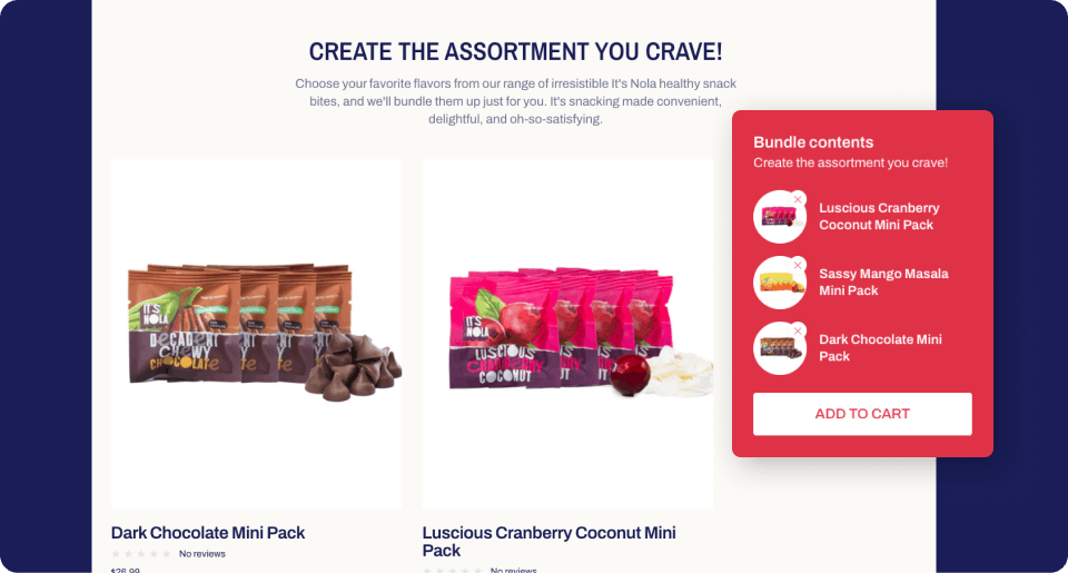
We transformed the Shopify experience to better support both direct-to-consumer shoppers and larger corporate buyers. The project included a complete restructuring of the site experience, refined product messaging, a custom bundle-building workflow that allowed customers to mix and match flavors from a single interface, and dedicated inquiry paths for corporate, event, and food service buyers.
Beyond improving the shopping experience, the site was designed to reduce manual communication, help customers find information on their own, and better support the different ways people interacted with the business.
Services
Web Design
Web Development
Shopify
Messaging
Collateral Design
See the Transformation
Turning the Website Into Part of the Business
Like many founders, Margaret built the original website while simultaneously learning how to run a business.
But as the business grew, she realized that creating a website and creating a website that supported a business were two very different things.
The website existed, but it wasn’t yet functioning as an active part of the business. She needed the website to help customers find information, guide purchasing decisions, and reduce the amount of manual work required to run the business.
"I thought I was creating something beautiful, and that once I created it and made it visible, everyone would come and see my beautiful dress.
I was like, 'Yeah, it's pretty, but how do I make the website work for me?' The website has to become an employee that works for me."
The redesign started with understanding how customers moved through the site and where friction existed.
"I got a call from a woman who said, 'I'd like to give you some free advice about your website.' She said it was really challenging to navigate."
Navigation was restructured to create clearer pathways between products, information, and purchasing decisions.
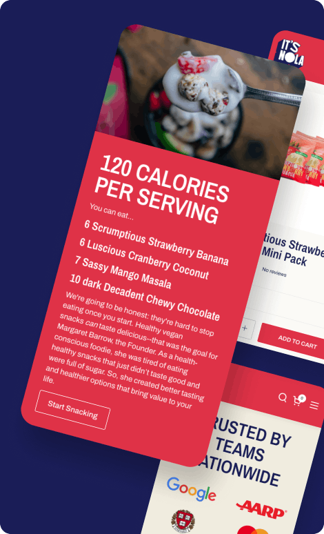
Product presentation was refined to better communicate what made the brand unique, while updated messaging helped visitors quickly understand the product and its value.
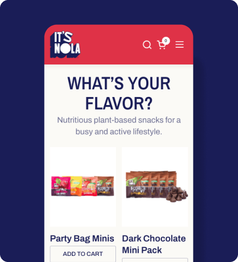
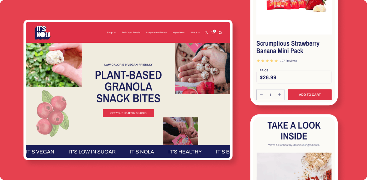
One of the most significant additions was a custom bundle-building experience.
Rather than forcing customers to navigate between multiple product pages, shoppers could explore flavors, build variety packs, and purchase from a single experience. This simplified the buying process while encouraging product discovery.
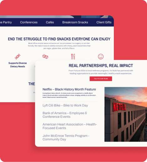
As the business expanded, it became clear that not every customer interacted with It's Nola in the same way.
"Customers aren't just one bunch. They're broken down into categories, and the website dealt with that really well."
A direct-to-consumer shopper has very different needs than a corporate office manager ordering snacks for a team or a food service buyer exploring larger opportunities.
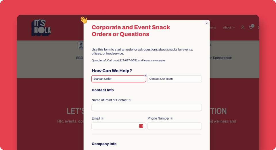
To support those audiences, we created dedicated inquiry paths and forms for corporate, event, and food service buyers.
This reduced unnecessary back-and-forth communication and shortened the buying journey.
"Creating the forms for corporate buyers and having all of that information there gave people very little reason to contact me with endless questions."
Rather than focusing on visual preferences alone, we evaluated competitors, Shopify themes, and functionality through the lens of customer needs and business goals.
This reduced unnecessary back-and-forth communication and shortened the buying journey.
"When you told me to find three websites I liked, I felt more confident after getting your feedback and your questions.
You'd say, 'Well, that's not going to work for your website, and here's why.' It was never just, 'That's not going to work.' It was always explained."
That guidance helped ensure every decision served a purpose and aligned with the goals of the business.
The Payoff
The redesigned website gave customers clearer information, reduced unnecessary back-and-forth communication, and created a smoother path for both direct consumers and larger buyers.
Most importantly, it transformed the website from a static storefront into a tool that actively supported the business.
"Going from where I came from with you to where I am today, it's such a huge difference."